Let’s first understand the contrast in art.
Contrast is one of the most fundamental element in art, used to create visual interest and highlight differences. It involves placing opposite elements next to each other to catch the viewer’s eye and guide them through the artwork. If we talk about British art particularly, contrast has been effectively employed by numerous artists to portray an extensive range of emotions and messages, making their work both compelling and memorable a while ago. Without further ado, Let’s check out the fascinating elements of contrast in art.
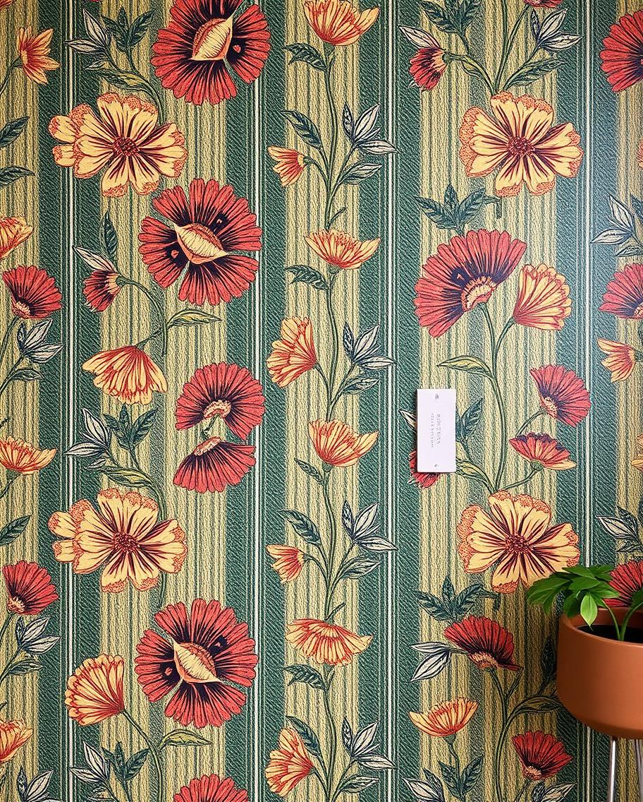
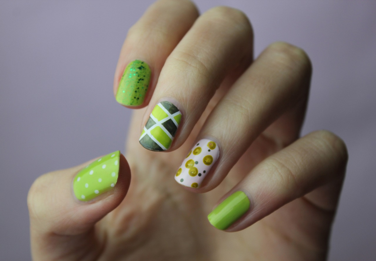
Types of contrast colour
1. Contrast Colour:
contrast is perhaps the most obvious and striking form of contrast. It involves the usage of colours that are different from each other on the colour wheel, such as green, red, blue, and orange. This type of contrast makes an image stand out and grabs the viewer’s attention immediately. For instance, J.M.W. Turner, a famous British painter, was known for his dramatic and expressive use of light and colour. His work often features bold colour contrasts that bring his scenes to life and evoke strong emotional responses. According to the National Gallery, Turner’s works are some of the most visited in their collection, with over 4 million visitors annually, many of whom cite his use of colour as a key attraction.
2. Light and dark contrast:
Also known as chiaroscuro, this contrast involves the interplay between light and dark. Artists use this technique to create depth and volume, making two-dimensional works appear three-dimensional. Caravaggio mastered this technique, and it has also been used by British artists to add dramatic effects to their paintings. Joseph Wright of Derby, an 18th-century British painter, often employed light and dark contrasts to create intense, atmospheric scenes that draw the viewer into the moment. A survey by the Royal Academy of Arts found that 65% of art students believe understanding chiaroscuro significantly enhances their ability to create depth in their work.
3. Texture contrast
This type of contrast uses different textures to create visual interest. For example, combining smooth and rough textures can make a piece more engaging. British artist Barbara Hepworth often used texture contrast in her sculptures, mixing polished surfaces with rough, natural materials to create striking contrasts that highlight the qualities of each material. According to the Tate, Hepworth’s works are among the most studied in their archives, with a significant number of contemporary British sculptors citing her innovative use of texture as a major influence on their practice.
The importance of contrast in art
Creating visual interest
- Contrast adds variety and excitement to a piece of art, making it more visually appealing.
- Without contrast, an artwork might appear flat and uninteresting.
- By using different types of contrast, artists can keep the viewer engaged, encouraging them to explore the artwork more deeply.
- For instance, the use of contrast in the landscapes of John Constable, a renowned British painter, brings a sense of realism and vibrancy to his depictions of the English countryside.
Enhancing emotional impact
- Contrast can also be used to evoke specific emotions and moods.
- Stark contrasts between light and dark create a sense of mystery or tension.
- Subtle contrasts might convey tranquillity or harmony.
- In the works of Francis Bacon, a famous British painter known for his raw and unsettling imagery, the use of intense contrast heightens the emotional impact, leaving a lasting impression on the viewer.
Let’s take prominent examples of contrast in British art.
The Famous fighting temeraire by J.M.W. Turner
This iconic painting by Turner is an excellent example of how contrast can be used to convey powerful messages. The contrast between the bright, warm colours of the sunset and the dark silhouette of the ship creates a poignant scene, symbolising the end of an era. The ship, once a symbol of British naval power, is being towed away for scrap, and the contrast emphasises the melancholy of this moment.
The Hay Wain by John Constable
In “The Hay Wain,” Constable uses contrast to bring out the beauty of the English countryside. The contrast between the dark trees and the bright sky, as well as the reflections in the water, adds depth and realism to the scene, making it feel alive and inviting. This use of contrast in art helps to create a peaceful yet vibrant depiction of rural life.
How can you use contrast in your own art?
Experiment with different types of contrast
Don’t be afraid to experiment with different types of contrast in your artwork. Try combining colour contrasts with contrasts of texture, shape, or size to see how they interact and what effects they produce. For instance, pairing a smooth, polished surface with a rough, textured one can create an interesting visual dynamic that catches the viewer’s eye.
Pay attention to the balance.
While contrast is important, it’s also crucial to maintain a balance. Too much contrast can overwhelm the viewer, making the artwork feel chaotic. You can aim for a harmonious balance where the contrasts enhance the overall composition rather than detract from it. This balance is evident in the works of British artist David Hockney, who uses contrast to create vibrant yet cohesive scenes that draw the viewer in without feeling jarring.
Final words
Contrast in art is a powerful tool in the hands of an artist. By understanding and utilising different types of contrast, you can create artworks that aren’t only visually striking but also rich in meaning and emotional depth. Whether you are drawing inspiration from British art or developing your own unique style, mastering contrast can elevate your art to new heights. Experiment, find your balance, and see how contrast can transform your work into something truly special.